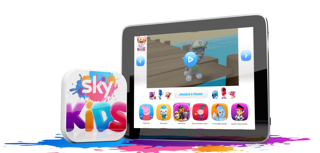
Research is often treated as a box-ticking exercise rather than an opportunity to connect with the audience. The development and build of our Sky Kids app was the complete opposite. Not only is it made for kids but, through our research process, it’s actually been made by kids. It is so unusual for kid’s opinions, behaviours and ideas to be taken into account all the way through the development process. All too often, products aimed at kids get made by adults and tested on kids too late to have a real impact. The bi-weekly sessions we held with kids and their families over the last 18 months have allowed us to create a ‘best in class’ product that has kids needs at its heart. And it’s why the Sky Kids app is already proving to be something that kids love, and that parents trust.
But let’s start at the beginning. Why an app? Before the app was conceived, we were looking at how we could create a great kids experience tailored to the new landscape of on demand viewing and increased access to tablets. We saw that re-imagining an existing product would not be enough. Kids have their own perspective and are growing up in a media landscape completely different to the past – all of our target audience have been born since the launch of the iPhone – we needed to start from scratch and create something with kids needs first.
Before we even started we asked children what they wanted so we could give them something they’d love. And we also asked their parents who told us they wanted an app that was simple and straightforward to set up and to know that their children are using an app that’s engaging and entertaining, but ultimately safe. Over 60% of parents told us that they worry about what their children watch when they are viewing on a mobile device, so building a safe environment that gives kids thousands of hours of their favourite shows without exposing them to inappropriate content was our founding principle. Going one step further, we developed a feature where by parents can filter out shows for older kids if their child is too young for them – and with up to 10 personal profiles available, this means that the Kids App can be tailored for each child.
During development, research was scheduled in the middle of each fortnightly development sprint. This meant that the team had a week to work up designs and prototype, as well as build new aspects of the real app, both of which we could test in-depth with kids and parents. This approach to testing was initially quite humbling – kids don’t hold back and they speak with unbridled honesty. However, the approach allowed us to be nimble and act quickly on their natural response to the experience; if things weren’t working, we’d change them and retest within less than two weeks.
A key set of principles were quick to emerge and which we incorporated into the experience. The first was to keep it simple and as visual as possible. A lot of our target audience can’t read yet, so we created a UI that doesn’t rely on words for kids to be able to quickly find their favourite characters and channel brands on their own. And we also emphasise what kids are able to do by never showing anything that is out of bounds. If parents choose to restrict older kids’ channels for their pre-schooler, we simply don’t display them rather than have them be inaccessible. This means that to kids, the experience always feels personal and they feel empowered. And we all know how important « I can do it myself » is to a child.
Whilst a highly personalised experience with custom UI for different profiles types is always alluring, we didn’t want to build a separate experience for each age in our target group. Creating something that would be simple enough for a 3 year old but not patronise our older kids was a challenge, but we did that by offering many different routes to the same destination. Offering more than one way to do something can feel redundant when designing for adults, but with kids it meant we could cater for different abilities and preferences. We learned what these might be via observation, adding useful feedback or functionality where kids gravitated naturally.
The great thing about apps is that they are iterative, and since launch we have continued to add new features. Episode downloads were introduced over the summer, along with Sleep Mode. Parents often worry about how much time their kids spend on devices, and we heard in our research sessions how difficult it is to get kids to switch off. But how much screen time is enough? Of course that varies with every family so our sleep mode allows the parent to choose an off-time which is announced by a five minute warning, presented by the child’s chosen Sky Buddy. When it’s time for down-time, the Sky Buddy reappears, snoring, and the app is disabled. Parents love this feature as it stops them being the bad guy and takes the friction out of a common household moment, particularly around bedtime.
We have been really pleased with the response to the app since it launched earlier this year. We’ve seen hundreds of thousands of households download the app, streaming over 30 million episodes so far. And the input from families throughout the development meant that the app we launched is one that kids really do love and parents trust.
Lucy Murphy is one of our pre-MIPCOM MIPBlog Ambassadors, who are coordinated by consultant Debbie Macdonald. Check out all of their posts to date here!


