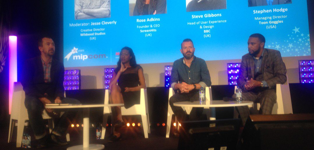
Moderator Jesse Cleverly, creative director, Wildseed Studios; Rose Adkins, founder/CEO, ScreenHits; Steve Gibbons, head of user experience and design, BBC; and Stephen Hodge, managing director, Toon Goggles.
In this session, three companies described the importance of thoughtful user interface design in driving content to viewers on their services.
ScreenHits is a B2B and B2C platform where broadcasters can find content to buy for their networks. They also have an OTT platform where content partners can sell directly to consumers. « What makes us unique in OTT is that we’re global, so we’re in every single territory and we take content from every single country, targeting the expats, » said Adkins, founder and CEO. « People in LA can go on there and watch something from Argentina. »
ScreenHits has been around for two years. The BBC, on the other hand, « has a huge history as a broadcaster, » said Gibbons, who leads user experience and design. « It’s about how we change, and what the audience expects from a broadcaster like the BBC. » The big challenge for the BBC is that it’s supposed to be for everyone —meaning you have to create relevant experiences for anyone, anywhere, while somehow still providing a sense of inclusion and intimacy.
« Most people want the quickest route to finding their content, others just want to be entertained but don’t know what they’re looking for, » Gibbons said. « We’ve found people are often quite worried that if the experience becomes too tailored, they’ll begin to miss things » as the algorithm gets smarter.
So for the BBC, « it’s about trying to find the balance where we present content relevant to you, but at the same time expose the great content we have. At BBC we’re lucky because we have a strong editorial history, so it’s about incorporating editorial curation » into the process.
Finally, Stephen Hodges introduced Toon Goggles, a curated global SVOD platform for kids which is based in the US but present in over 18 languages. « Our real mission is to expose independent professional producers to audiences who can enjoy their content. »
Toon Goggles targets kids between 6-12 years of age. « They’re using it mostly on tablets, children’s tablets as well as smartphones, which I’m sure their parents are handing to them at convenient times, » Hodges observed. « Children don’t have access to credit cards, so we have a freemium business model, where parents can turn off the advertising by paying a small fee. »
There’s also a « Pandora for children »-style music service, curated to ensure there’s no profanity or sexually suggestive content.
Targeting children poses interesting challenges in terms of UI, said Hodge, so it’s important for TV suppliers to understand the UI differences inherent to their distribution platforms.
« YouTube, Vimeo and other such services let a user customise their experience a bit more… It puts a producer in a position where he can create what would look like their own OTT service that they can monetise in their own ways, » said Hodge.
On the other hand, for children, « a Hulu-style interface is not appropriate » because it was designed specifically for adult consumption. Understanding how a child versus an adult experiences content is integral to serving either target in a smooth way.
Today, aspirers of any stripe can go to MIP, create their own channels, and make partnerships with consumer electronics companies, Hodge said. It’s easier than ever to create your own brand—which makes the subtle differences in a user interface crucial.
« That’s why learning about UI is so important—it’s the first point of interaction between you and your customer, » said Hodge. « It’s how they navigate, how they find content. It’s what makes or breaks your platform as a whole. »
Adkins’ experience building ScreenHit helped illustrate this point. « One of the biggest mistakes everybody makes is to copycat, » she said. « You have huge companies like Hulu and Netflix who spent so much money on their UI, so why bother coming up with something different? »
So when ScreenHit was born, they took their cues from how existing OTTs were organised and created a site that, while functional, lacked a design that accounted for ScreenHit’s unique content selection (which is quite small—about 200 titles appear on the site at the same time, and are rotated every few months).
Though the first iteration of ScreenHit didn’t make the impact they hoped, building it gave them time to understand how ScreenHit’s specific content offerings related to users.
« We were never gonna be a Netflix that has 20,000 or 30,000 titles; we wanted to be a curated site, » said Adkins, who explained that an effective experience depends on first analysing the content you have.
ScreenHit’s small but tailored selection of content also affects elements as basic as navigation.
« We avoid the whole ‘search’ thing, » said Adkins. « Unless you have all the content in the world, if a fan looks for something and they don’t find it, it’s a very disappointing experience. So we wanted to ensure the UI focused on discovering and browsing—never searching for what you’re looking for. »
The goal of driving discovery manifests in the visual nature of its category system, which encourages you to keep clicking through images until you find something that suits your fancy.
« We categorise by genre. We have everything broken out with an image: If it’s horror, they’ll see an image of Psycho or something like that. If anybody wants to search by language, it’s the same: they’ll see a very recognisable Spanish film. »
Gibbons pointed to the difference between designing for digital versus traditional platforms. « Before it was just about putting TV online, but now it’s about making online TV. It’s a subtle difference. »
Generally speaking, « it’s the first year that tablet use has outstripped every other device. You also see the incredible shift in smartphones as well. »
And all content isn’t created equal. For mobile, « short-form, snackable content of about 3-4min long works. But the key there is the moment [the video’s done], you need to have the next thing lined up right away. » Long-form content, on the other hand, « is more a lean-back experience. »
The rise of responsive design ensures that experiences between different screens stay coherent. « Someone who’s watching on their desktop, then tablet… there’s a kind of learned behaviour that goes with them. They can learn [the functionality]once and use it everywhere, » said Gibbons.
To humanise the details, he used a universal anecdote. « I travel to work on the train. Everyone has their phone on them and they’re watching content. It’s those moments in your day that you can kind of fill. »


